
Media Street have been offering a diverse range of digital services to local and international businesses for over 10 years. With a credible client portfolio and a wide knowledge of all-things-digital, we have helped businesses grow through creative website and graphic design, successful marketing campaigns and competitive hosting packages, plus much more. Take a further look into our latest news articles, learn more about our staff and how we can help your business excel with our FAQs and testimonials
Access and Manage your accounts with Media Street. To login to your client areas please select the relavent link below.
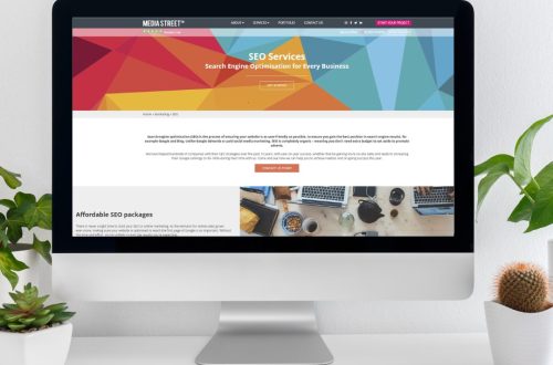
We're proud to be a full service digital agency. For a list of our services please navigate services using the menu to the left, or choose a service category below.
Alternatively you can view all of our services below:
View AllAnimation is a powerful web design tool, and can be used to enhance user experience if done right. Many graphic designers are wary of using motion on websites, as over-use of such methods can complicate the functionality of a site and actually detract from its effectiveness. However, as internet users increasingly seek instant gratification online, subtle animations can make your website more sleek and efficient – if used in the right way.
The first thing to remember is that less really is more here. Don’t be tempted by “eye-catching” fast-moving shapes, over the top GIFs and flashing pop-up adverts. Yes, these elements are eye-catching, but for all the wrong reasons. They will not draw users in to be interested in the content they present, but will detract attention from the content on your website and actually repel the eye, causing potential clients to leave your site.
In recent years, developments in CSS such as CSS3 and HTML, like HTML5, along with increased browser speeds, quicker devices and internet connections have enabled designers to make exciting use of animation in ways that look great, and work. Now many websites even feature motion on their mobile version, meaning that animation can be incorporated into responsive web design for any device. But it is still essential to focus on function rather than aesthetics. Use animation where it will add to a customer’s navigation experience on your website, not just to look good. Here are five of the best ways to do just that…
‘Loading’ progress icons are nothing new to web design, however, choosing the right one can completely change the way users respond to this waiting period on your site. A simple ellipse or bar is fine, and gets the point across, but something a little more dynamic can be so much more interesting to the eye. For example, on sections of your website that may require ‘forms’ or fields to be filled, a ‘submit’ button that, once clicked, morphs into a loading icon that corresponds to indicate loading progress looks so much more slick and professional. When the content is loaded, the icon will revert to button form with some form of success message.
This animation means that users don’t have to click through several forms, buttons, or sit and wait for multiple pages to load just to know that they have successfully submitted information – it’s all done in the click of one button!
The number one time when web users may be likely to leave your page is whilst waiting for it to load. If their internet is slow, or your site is experiencing high levels of traffic, it is key to have some form of loading message in place to keep users captivated and trusting that the content will appear soon. Adding a lightweight animated effect whilst a new page loads is brilliant for keeping customers present and engaged. Animating a shape of your choice that indicates activity will reassure users that the page will be displayed soon, as well as keeping the eye interested during this waiting period.
This feature is very popular at the moment, due to both its visual appeal and success. There are many effects to choose, from parallelograms, ellipses and rotating circles to windscreen wipers and spill effects. Think creatively – you can go big here with a large graphic and any form, as long as it communicates the point efficiently, is functional and visually pleasing. Displaying an entertaining or friendly message underneath and a ‘help’ option will finish off the effect to keep users informed and satisfied.
Before designing your mobile website you must remember two things – firstly, fingers are bigger than mice arrows, and second, the screen is a whole lot smaller. These two facets together mean that graphics, shapes and buttons need to be a lot bigger and display only key information rather than blocks of text. Mobile users are even less patient than PC users as they can’t see as much text due to the small screen size, and are often on the move whilst using their device.
However, mobile devices actually open up a huge scope for the use of animation. It can be a challenge to create a clean, simple interface and a vibrant user experience at once for such a small device, but here you really can design not only the look of your website, but also the way customers use it. Simple effects can achieve this, such as menu transitions, where upon selecting an option from one menu, rather than a simple load of a new page, the current page transitions swiftly to one side to display the new set of options, or content, desired. This is captivating in a very simple way, and makes your site look professional and sleek, whilst making the process of using it much more smooth.
Many web users dislike filling in forms online. Long pages of empty fields and questions can immediately make a customer feel disinterested and frustrated. However, you need them to input this information, and they need to do so, too, for you to provide them with the best experience of your company possible. One way that many modern websites are tackling this problem is with minimal forms, cutting out distractions and making the process quick and simple.
Such forms often feature only one field at a time, with an arrow or “enter” sign beside it, which, when selected (or ‘Enter’ is pressed), transforms the field to display a new question. This makes users feel much less overwhelmed by questions, so that they can enter their responses quickly and without feeling stressed. This animation will significantly increase the number of users who are willing to submit information for surveys and feedback, allowing you to develop your business as you would like to whilst keeping web users happy at the same time.
Infographics are becoming more and more popular as an alternative to long text-heavy articles on websites to communicate information quickly and effectively. Here, statistics and facts are displayed visually in an appealing manner with graphics and stand-out text which shows the basic information the customer needs. The use of infographics and graphs is great for speaking to your audience at speed without them feeling bored by having to trawl through text to get to the data they need.
Interactive infographics and graphs, then, are even better. As more browsers are now supporting SVG file formats (scalable vector graphics), which is built on XML, graphic designers are able to manipulate images created through this format in a similar way to CSS or Javascript. Visual information is even more engaging when the web user can interact with it via their actions – this will keep them very interested in the data being displayed. Even if it is as simple as showing the increase in sales of a certain item on a graph and having the ‘sales’ bar grow when hovered over by a mouse, this could totally transform how customers will respond to your website for the better.
These five examples of fully functional, but also fun, animated web design, are very popular with contemporary web designs. Injecting a bit of energy and interest into your website whilst keeping it relevant and useful is the perfect way to show your clientele that you are a creative, professional business, but also one that essentially has their needs as a matter of primary importance.
Of course, unless you are a qualified web designer, these effects can be very difficult to achieve. If you want your website to become an enlivened hub of information and user engagement, contact one of our web design Exeter team to see how we can implement these modern features to make your business’ online presence more vibrant and successful.


 01392 914033