
Media Street have been offering a diverse range of digital services to local and international businesses for over 10 years. With a credible client portfolio and a wide knowledge of all-things-digital, we have helped businesses grow through creative website and graphic design, successful marketing campaigns and competitive hosting packages, plus much more. Take a further look into our latest news articles, learn more about our staff and how we can help your business excel with our FAQs and testimonials
Access and Manage your accounts with Media Street. To login to your client areas please select the relavent link below.
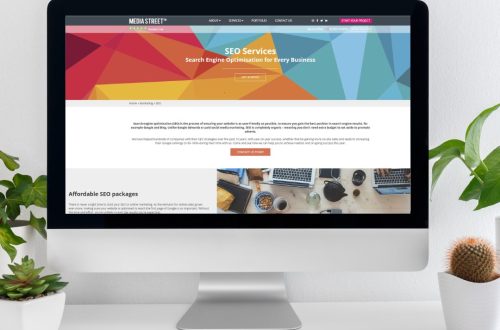
We're proud to be a full service digital agency. For a list of our services please navigate services using the menu to the left, or choose a service category below.
Alternatively you can view all of our services below:
View AllBack in 2011 we released a blog article discussing the growing prominence of smartphones in the ways that internet users surf the web. Then, a study by the Pew Internet Project stated that 35% of American adults owned a smartphone; but now in 2014 this percentage has risen to over 70. It is estimated that there are now 1.75 billion smartphone users in the world and millions of tablet users. So, it’s essential that your web design is fully optimised for such portable devices, or, as the industry says, is “responsive”.
Of course, now our web design are mobile compatible as standard, but as more devices are being developed and released every year, such as the recent smartphone watches, it is essential to keep up the the most recent web interfaces when considering your website design. Creating a design that is attractive to the eye and fully functional on PC monitors, laptops, tablets, smartphones and now even wearable devices is key in ensuring a successful online presence for your company.
This is responsive web design. Eye-catching graphics and informative content, are, of course, important to any website, but this is no use if you haven’t ensured that your design will look its best on a whole range of the many mobile devices on the market. Every user opening your site, on every page, must be able to view the content and information in its intended, accessible manner, to ensure that they will enjoy their experience of your company website and return again; as well as encouraging conversions or contact.
Responsive web designs react automatically to the device they are viewed on, including even games consoles and television screens. This is vital for your website as the way in which users interact with and behave on different platforms varies with the type of device. The smaller the device, the shorter users’ attention spans will tend to be. So someone using a desktop or laptop screen will be willing to navigate your site slightly longer to find a ‘contact’ page, whereas a user accessing it via a smartphone will want that information to be available straight away on a homepage or landing page. If your website doesn’t load information quickly or present it in an easily-digestible manner, users will quickly become tired of waiting and may move on.
Web design for portable electronic devices necessitates the use of larger buttons and less information, using clear fonts and designs, and only the graphics absolutely needed. As smart device users are often on the move whilst using their gadget, their attention will be divided – they may be on public transport, searching to find their way or at an event. A recent study suggests that only 10% of the Small and Medium-sized Enterprises (SMEs) in the UK use mobile-optimized websites, and that as a result they have missed a total of £77 billion in revenue! The growing popularity of wearable devices means that web designers are creating optimised websites with minimalistic layouts, immediate information at the fingertips and interactive designs.
A good responsive web design can improve your business website’s visual appeal on mobile devices, reassuring your customers that your company is modern, professional and reliable. It also improves user experience, leaving customers feeling calm and satisfied having easily found the information they need. Successfully made responsive smart device designs also work towards driving conversions, as many users now make purchases throughout the day on their mobile devices. The simple layouts and ease of mobile websites encourage tendencies towards compulsive purchases, as it is much easier to complete a transaction. It’s also important to ensure your responsive web design is effective so that you and your management team can access and update the admin end easily.
Responsive websites are undoubtedly the future of web design in a technological climate commonly dubbed the ‘internet of things’, where devices and operating systems are constantly updated and turned over. If you want your company’s website to keep up and remain at the forefront of your market area online, a responsive website design is absolutely essential. All of Media Street’s website designs are fully responsive across all browsers, devices and we are even looking into developing technology for devices as advances as Google Glass! To find out more about the exciting possibilities responsive web design opens up, contact us today!


 01392 914033