
Media Street have been offering a diverse range of digital services to local and international businesses for over 10 years. With a credible client portfolio and a wide knowledge of all-things-digital, we have helped businesses grow through creative website and graphic design, successful marketing campaigns and competitive hosting packages, plus much more. Take a further look into our latest news articles, learn more about our staff and how we can help your business excel with our FAQs and testimonials
Access and Manage your accounts with Media Street. To login to your client areas please select the relavent link below.
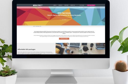
We're proud to be a full service digital agency. For a list of our services please navigate services using the menu to the left, or choose a service category below.
Alternatively you can view all of our services below:
View AllA logo can dictate your whole company ethos, so you really need to give a lot of thought, as to what look and feel you want to give to your main identity. A logo is often someone’s first impression of your services, it’s an expression of company values, culture and people. Colours, fonts and so on can really affect how the rest of your brand should look and feel. First impressions last, and having others believe in you and feel confident right from the start can only be a good thing.
Logo designers are in great demand, and for a good reason. Sure you can design a logo yourself, or even use an online logo creator. But is a crumby, slap-dash logo really how you want to portray your business? Probably not. Professional logo designers aim to learn as much as possible about your companies culture, values and the way that you conduct business. To establish a good identity, a logo needs to reflect company values, personality and customers. You may have to go through a lot of stages and reject a lot of good ideas throughout the design process, but this shouldn’t put you off. It can be an interesting journey, where you learn a lot about how others perceive you and what sort of image you want to portray.
Simplicity is often the key to a good logo. Think of the most famous logos or biggest brand names, and you can usually envisage their logo without even seeing it, e.g. Apple, Volkswagen, Batman, Pepsi, Nike, DVD, MacDonald’s. If consumers can picture your logo in their mind without actually seeing it, then that is a really powerful concept. Complex logos can still work, but you need to think about how your identity is being portrayed, how your logo will stand out against a sea of competitors, and how people are going to remember you.

![]()
![]()
A common mistake for logos, is that they just resemble what the company (organisation or charity) produces or provides. This makes sense for the most part, but how is anyone going to tell you apart from the competition? The most successful logos are generally based around the brand name, or where their roots lie. Apple Computers logo isn’t a computer and pretty much all car manufacturers logos aren’t of cars. They chose something that is unique and different. They quite often contain a hidden meaning or subtle visual aspect that goes deeper than what you see at first glance. For example BMW’s logo (a circle split into quadrants of alternating colour), commonly thought to show the propellers of a plane, actually represents the colours of the Free State of Bavaria. Audi’s four interlocking rings represent the merger of four companies. The FedEx logo contains a subtle arrow moving forward (between the ‘E’ & ‘x’) and Toblerone’s mountain logo contains a hidden bear, which resembles not only the Swiss Alps, but is also symbolic of the company’s home town of Bern, which means ‘city of bears’. My personal favourite is The Northwest Airlines logo, which clearly shows an ‘N’. Look closely at the ‘N’ and the triangle and you will see a ‘W’. If you look even closer you will see that the ‘N’ and the triangle are actually a compass which point to (you guessed it) North West.
![]()
![]()
![]()
![]()
A good logo doesn’t necessarily have to cost a lot of money, and it is also a good investment. Having said that, a good logo can evolve, just like a business. Old fashioned values are great, but we also need to move with the times. Large companies and organisations often re-assess their brand and give it a face-lift after a period of time. John Deere, the famous tractor manufacturer, made a subtle adjustment to their logo of a prancing deer. The deer was landing from it’s leap and the company felt that it would be more positive to have the deer going up, so they embarked upon a complete re-brand. Personally, I think it could have been improved further if it was projecting itself forward and to the right, rather than to the left (backwards). Maybe they never thought of that. Needless to say, no project is the same and every client differs, so a designer can’t give an accurate quote until a design brief is in place, and that doesn’t happen until after meeting with or talking to the client.
“A logo does not sell (directly), it identifies.” – Paul Rand, Graphic Designer
“Symbolize and summarize.” – Saul Bass, Logo Designer
“There are three responses to a piece of design – yes, no, and WOW! Wow is the one to aim for.” – Milton Glaser, Graphic Designer
If you’re after a logo, an updated logo, or are just after some advice, then please don’t hesitate to contact us at Media Street.


 01392 914033