
Media Street have been offering a diverse range of digital services to local and international businesses for over 10 years. With a credible client portfolio and a wide knowledge of all-things-digital, we have helped businesses grow through creative website and graphic design, successful marketing campaigns and competitive hosting packages, plus much more. Take a further look into our latest news articles, learn more about our staff and how we can help your business excel with our FAQs and testimonials
Access and Manage your accounts with Media Street. To login to your client areas please select the relavent link below.
We're proud to be a full service digital agency. For a list of our services please navigate services using the menu to the left, or choose a service category below.
Alternatively you can view all of our services below:
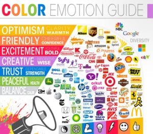
View AllThere is a lot to be thought about when using colour in design. Colour in design is very subjective. What evokes a reaction with one person may evoke a totally different reaction in someone else. Different sexes like different colours too. Men and women collectively like blue, followed by green, but women on the whole aren’t so keen on orange, brown or grey. Men generally aren’t too keen on purple, but women are.

However, you shouldn’t just be using colours that you like or that you think others will like, you should be using colours that work. When I say work, I mean, think about what your specific piece of design is meant to achieve. If it’s a road sign, for example, then you don’t really care about colours looking pretty or appealing, you just want your message to shout out. If you are selling a specific product then you want the colours to reflect the type of product and aim it at your target audience. Also, if you are trying to target a particular age group, colours can have a big influence. Brand colours will often limit your colour palette, but using them effectively is the key to success.
Using the right colour in the right way can have great advantages and make the difference between engaging your audience or instantly turning them off. For instance, yellow brings on anxiety in most people, so this might be a colour that is best avoided, except for maybe the odd button on your website, or something that you really want to shout out. Pepsi discovered about using the wrong colours after changing the shade of its South-Eastern Asia vending machines from dark blue to light blue. The result? Sales plummeted. Research conducted after sales dropped showed that, in this culture, light blue is heavily associated with death. A pretty expensive mistake to make!
When telecom company Orange unveiled its slogan “The future’s bright, the future’s Orange” in Northern Ireland, it didn’t know about the country’s ‘Orange Order,’ a Protestant fraternal organisation. The telecom company’s slogan suggested a Protestant future in heavily Catholic Northern Ireland. Not exactly the launch reaction Orange was hoping to receive.
On a simple level, the colours on the warm side of the spectrum – such as red and yellow – are bold, uplifting and energetic, while their cooler counterparts, blue and green, exude calmness and feel more reserved.
Five ways of using colour to your advantage include:
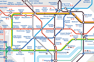
London Underground maps are a good example.
We recognize objects more quickly when their colours reflect what we see in the physical world.
Colours can compliment each other or be used to emphasise certain things. Black and yellow are strong contrasting colours, which stand out strongly against each other.
Colour coding can be used to great effect. Technical books, folders or wiring diagrams all contain examples of this.
In marketing and advertising, brand identity can be everything. The whole feel of your company can be conveyed just in colours.
If want any advice with colours or are looking to rebrand your business, then please get in touch with us at Media Street.


 01392 914033