
Media Street have been offering a diverse range of digital services to local and international businesses for over 10 years. With a credible client portfolio and a wide knowledge of all-things-digital, we have helped businesses grow through creative website and graphic design, successful marketing campaigns and competitive hosting packages, plus much more. Take a further look into our latest news articles, learn more about our staff and how we can help your business excel with our FAQs and testimonials
Access and Manage your accounts with Media Street. To login to your client areas please select the relavent link below.
We're proud to be a full service digital agency. For a list of our services please navigate services using the menu to the left, or choose a service category below.
Alternatively you can view all of our services below:
View AllLogos can come to develop powerful meanings in the mind of the customer. Particular shapes and colours become deeply associated with certain brands and feelings associated with that company. For example, yellows incite happiness, reds communicate passion and blues induce a calming effect on those who look at them. In fact, a good logo is so powerful that, according to research, 93% of the world’s top 100 brand logo designs are powerful enough to be understood even when viewed in the smallest of sizes.
If you want your company to prosper, you will have to create a logo design that perfectly represents everything you stand for. Luckily, there are plenty of places to find inspiration. The world’s most iconic logos are understood internationally in almost every country and culture. Here we look at three of the most famous logos in the world, how they have changed over the years, and why they are so effective.

Coca Cola was invented in 1886 by John S. Pemberton. A year later, the scripted words ‘Coca Cola’ in a Spencerian font we![]()
By 1900, the shape and detail of the logo was becoming more standardized, although the designers began to experiment with the now iconic red colour. In 1969, a swirling line was added underneath the text logo, a fixture which has predominantly remained with the logo ever since. During 2002, the can packaging was redesigned and updated, resulting in ![]() slight differences in design depending on which part of the international market Coca Cola was targeting. However, by 2009 the company realised that simplicity was the way forwards, and opted for the trademark bright red background with white Spencerian font and ‘dynamic ribbon’ swirl.
slight differences in design depending on which part of the international market Coca Cola was targeting. However, by 2009 the company realised that simplicity was the way forwards, and opted for the trademark bright red background with white Spencerian font and ‘dynamic ribbon’ swirl.
So why does the Coca Cola logo work? It is largely the recognisable Spencerian typeface that we all associate with Coca Cola today, and the reason why it is so effective is in its consistency. Take Pepsi compared with Coca Cola. As you can see in the image, Pepsi have changed their logo many times, whereas Coca Cola’s logo has remained more or less the same since 1885. We all know which is more memorable. This swirling font, along with the bold white and red colours are what makes the Coca Cola logo so powerful.
The Coca Cola christmas Santa is also a key figure in the brand’s advertising. Each year we see a new magical advert on our televisions from Coca Cola, even leading many to say ‘it’s not Christmas time until the Coca Cola advert is on’. This character was first developed in 1931 and has since been established as perhaps the most clever piece of seasonal marketing in the world.
The world’s most famous fast food chain was first founded in 1940 by Richard and Maurice McDonald, and was originally called “McDonald’s Famous Barbeque”, and then “McDonald’s Famous Hamburgers” in 1948.
Initially, the McDonald’s logo was far from the distinctive ‘M’ is is now. Small cartoon figures and text made the logo somewhat over-complicated, and so in 1960, the design was completely reconfigured to introduce the now world-famous ‘Golden Arches’. This was designed by Stanley Meston, initially simply for the front of the actual restaurants. At first this translated into a logo with two separate yellow arches overlapping and a line straight through the middle, all with a red outline.
The Golden Arches logos reference the signature architecture of the double mansard-roofed restaurants from this era. The line was then removed in 1968 ![]()
The bold red and yellow colour of the McDonald’s logo has endured decades and remained relevant throughout. These two colours together speak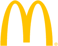
A recent survey by Sponsorship Research International found that 88 per cent of people could identify the McDonald’s golden arches, whereas only 54 percent could name the Christian cross. This is not so surprising when you consider that the logo transcends so many cultural boundaries across the world.
The first ever Apple logo would probably be unrecognisable to even the biggest Apple enthusiast today. It was designed by Ronald Wayne in 1976, and is depicts Isaac Newton sitting below a tree with an apple dangling over its head. Only a year later, Steve Jobs called for a graphic design expert to completely rehaul the logo into something more contemporary, which gave birth to the apple logo with a bite much closer to what we might recognise, although then it featured multi-coloured stripes. The now world renowned bite out of the right hand side of the apple was soon taken by the company as a technical bite/byte in-joke that has stuck. This logo was then axed in 1997 and replaced with the monochrome symbol we know today, which was intended to exude class and technological superiority.
The Apple logo is incredibly prominent in the current tech market and is associated with sleek, cutting-edge products.![]()
The simple shape and slick colour shading really reflect the quality of the products. Apple began enlarging the logo and placing it on all of its products shortly after its monochrome redesign and today it has become something of a badge of preferment for many of the company’s dedicated customers. The current logo streamlines perfectly into the products and the apple ‘bite’ is now universally recognised as being associated with the brand.
According to the designer of the first apple-shaped logo, Rob Janoff, the bite out of the apple was initially added so that people didn’t think the image was supposed to represent a tomato!
![]()
If you would like to find out more about designing the perfect logo for your business, contact our team of expert graphic designers with years of experience in creating beautiful logos today.


 01392 914033