
Media Street have been offering a diverse range of digital services to local and international businesses for over 10 years. With a credible client portfolio and a wide knowledge of all-things-digital, we have helped businesses grow through creative website and graphic design, successful marketing campaigns and competitive hosting packages, plus much more. Take a further look into our latest news articles, learn more about our staff and how we can help your business excel with our FAQs and testimonials
Access and Manage your accounts with Media Street. To login to your client areas please select the relavent link below.
We're proud to be a full service digital agency. For a list of our services please navigate services using the menu to the left, or choose a service category below.
Alternatively you can view all of our services below:
View AllYour homepage is the beating heart of your website; it welcomes viewers to your business and provides access to the rest of the site. It’s therefore vital to make sure that it’s absolutely perfect. That might seem like a lot of pressure, but there’s no need to panic. If you follow our three golden rules of homepage web design, you can create a homepage that’s attractive to customers and optimised for search engines.
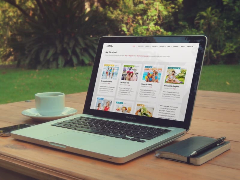
The text on your homepage should give your viewers a brief, snappy insight into who you are and what you do. Many businesses make the mistake of loading their homepage text with excessive details. The truth is that you only need to provide a short ‘text sketch’ of your business so that potential customers know they’ve found the right kind of business. You can give them more detailed information about your individual products and services on the appropriate pages, and provide insight into the business’s history and mission on your ‘about us’ page. By keeping the text on your homepage brief, you ensure that it’s easy to digest and doesn’t become boring. Viewers can assess whether your business is right for them quickly and easily. This means they’re less likely to lose interest and go elsewhere, and more likely to feel positively disposed towards your enterprise.
A picture is worth a thousand words, but too many pictures aren’t worth your viewer’s time. When you’re building your homepage, choose a single, powerful, high-quality image that you feel represents your company. Before your viewers begin to process your text, they will start to form an opinion of your business based on the imagery you use. It is therefore advisable to focus their attention on a single image that says something positive about your business. If you use too many images, the impression you create will be confused and won’t give viewers a reason to put their trust in you. That doesn’t mean you can’t use additional images if you need to; just make sure you put them below the fold so that the viewer is only confronted with your single, chosen image when they first load your page.
Branching navigation systems with too much complexity tend to baffle and irritate web users. While complicated, multi-layered systems may make it possible for viewers to access every single page of your site directly from the homepage, that benefit is far outweighed by how confusing and counterintuitive they are. Most of the time, complex navigation systems lead to an excessively high bounce rate. Web users prefer a simple, intuitive navigation system that allows them to browse your site without having to concentrate too hard on the process. Reduce your navigation system to a simple navigation bar that gives viewers access to the main parts of your site; because this system is so easy to use, you’ll find that lots of people will make use of it and go deeper into your site.
Web design for homepages can be challenging. However, by following the three golden rules we’ve laid out here, you’ll be able to create a page that appeals to web users of every kind.


 01392 914033